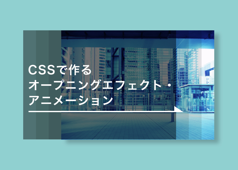
【簡単】cssで作るオープニングエフェクト・アニメーション【コピペでOK】
HTML/CSS
プログラミング
こんにちは!コーダーのだいちゃんです。
オープニングエフェクトやオープニングアニメーションはおしゃれなサイトにはよく使われていますよね。今回はcssを使用したシンプルなオープニングエフェクト・オープニングアニメーションを3つ紹介します。
全てcssの@Keyframesとanimationプロパティだけで動くのでコピペで実装できます!
左からカーテンのように開くアニメーション
左からタイミング違いで2層の幕が横に開くオープニングアニメーションです。
animationプロパティで秒数やタイミングを指定し、@Keyframesで幕の幅を変更(widthを100%→0%)することで開くような表現を実現しています。
html
css
.top-op,.top-op2{
  position: fixed;
  top: 0;
  left: 0;
  margin: 0 auto;
  width: 100%;
  height: 100vh;
}
.top-op{
  z-index: 99;
  background: #f2f2f2;
  animation-duration: 1.2s;
  animation-delay:1.4s;
  animation-fill-mode: forwards;
  animation-name: top-op;
}
.top-op2{
  z-index: 100;
  background: #e2e2e2;
  animation-duration: 0.7s;
  animation-delay: 0.6s;
  animation-fill-mode: forwards;
  animation-name: top-op2;
}

@keyframes top-op{
0% {
  width: 100%;
  left:0;
}
50% {
  width: 100%;
}
100% {
  width: 0%;
  left: 100%;
}
}
@keyframes top-op2{
0% {
  width: 100%;
  left:0;
}
50% {
  width: 100%;
}
100% {
  width: 0%;
  left: 100%;
}
}
ロゴ入り背景がフェードアウトするアニメーション
読み込み時にはロゴ入り背景が表示され、その後フェードアウトし本サイトが表示されるというオープニングアニメーションです。コーポレートサイトなんかでたまに見ますね。
z-indexプロパティでロゴ入り背景をbody要素の前面から背面に切り替えています。opacityプロパティを使っても同様の表現は可能ですが要素自体がbodyの前面に残ってしまうため、z-indexを使用します。
html

css
.shutter{
  width: 100%;
  height: 100%;
  position:fixed;
  top:0;
  left:0;
  right:0;
  bottom:0;
  margin: auto;
  background-color:#fff;
  z-index:99;
  -webkit-animation: byeShutter 2.4s forwards;
  animation: byeShutter 2.4s forwards;
}
.logo {
  position: absolute;
  width: 120px;
  top: 0;
  left: 0;
  right: 0;
  bottom: 0;
  margin: auto;
  -webkit-animation: logo 0.8s forwards;
  animation: logo 0.8s forwards;
  animation-delay: 0.2s;
}
@keyframes byeShutter {
70% {
  opacity: 1;
}
100% {
  display: none;
  opacity: 0;
  z-index: -1;
}
}
@keyframes logo {
0% {
  opacity: 1;
}

50% {
  transform: rotate(0deg);
}
  100% {
  transform: scale(0.8);
  }
}
四隅が縁取られるアニメーション
読み込み数秒後に四隅から枠が出てきてサイト全体が縁取られるというオープニングアニメーションです。あまり見ないアニメーションですがクリエイターのポートフォリオサイトなんかに使えそうです。
サイト全体がスクロールスナップになっているレイアウトや、四隅に合わせてメニューの文字等を配置したりすると合うかもしれません。
html
css
#border-u,#border-d{
  animation-name: fadein-ud;
  animation-duration: 0.4s;
  animation-delay: 1.5s;
  animation-fill-mode: forwards;
}
@keyframes fadein-ud{
0% {
  height: 0;
}
100% {
  height: 30px;
}
}
#border-l,#border-r{
  animation-name: fadein-rl;
  animation-duration: 0.4s;
  animation-delay: 1.5s;
  animation-fill-mode: forwards;
}
@keyframes fadein-rl{
0% {
  width: 0;
}
100% {
  width: 30px;
}
}

#border-u,#border-r,#border-l,#border-d{
  position: fixed;
  background: #ffffff;
  z-index: 999;
}
#border-u{
  width: 100%;
  height: 0px;
  top: 0;
}
#border-r{
  width: 0px;
  height: 100vh;
  right: 0;
}
#border-d{
  width: 100%;
  height: 0px;
  bottom: 0;
}
#border-l{
  width: 0px;
  height: 100vh;
  left: 0;
}
このようなオープニングアニメーションを考えるのは楽しいですよね!
一つ一つはシンプルですが組み合わせることでおしゃれな動きを実現できます。アニメーションのタイミングやテンポも重要になってきます。
ブランドサイトやポートフォリオサイトに使用すると世界観をイメージさせたり、印象に残りやすくできるので効果的です。むやみに使うとユーザビリティの低下に繋がることもありますが、うまく使えると非常に効果的なのでぜひ活用してみてください!
次回以降はアニメーションの組み合わせ事例やJavaScriptも使用したもっと複雑な動きも紹介していきたいと思います。
この記事をシェアする


